Minimalist website design focuses on simplicity and elegance. It removes unnecessary factors and specializes in structured layouts that highlight content and offer a seamless user experience. In this blog, we will get to know some minimalist website design examples that will inspire your next project.
Introduction to Minimalist Web Design
Minimalist website design means keeping things simple and clean. The focus is on developing attractive, easy-to-use websites free from confusion. By emphasizing the most beneficial and essential factors and removing the unnecessary, the minimalist design ensures that site visitors can quickly discover what they want without distraction.
Why Choose Minimalist Web Design?
Minimal site design is ideal for creating a professional, user-friendly experience. It allows your content to shine and provides easy navigation for users, making your website responsive for all devices and engaging. These minimal designs emphasize clear and straightforward website architecture. Here are some key reasons to consider minimalist design:
- Improved Load Times: Fewer elements in website improve loading times, which is important for keeping visitors engaged.
- Improved user experience: Clean layout and intuitive navigation improve usability.
- Focused content: The minimalist layout ensures your content takes center stage by eliminating distractions.
15 Best Minimalist Web Design Examples
After knowing what importance minimal site design holds increating a website for business, let’s uncover the 15 best minimalist website design examples:
1. Mogutable
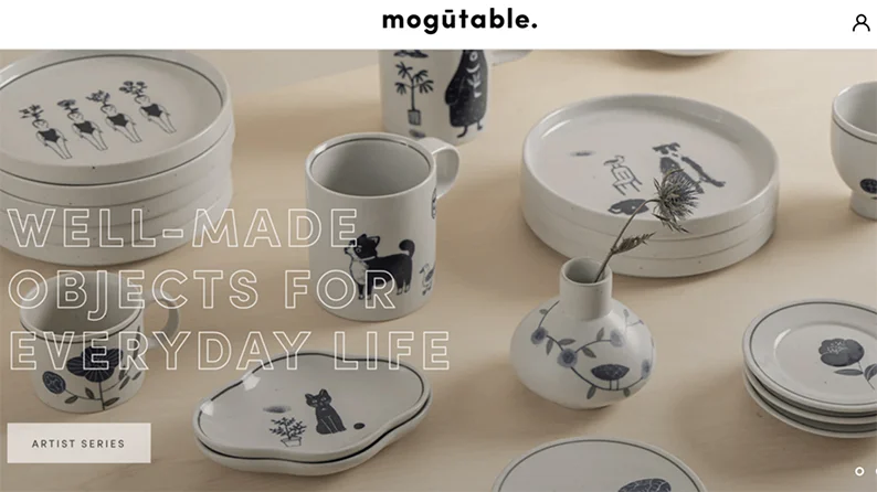
Mogutable’s minimalist design highlights its luxury products through a clean, organized grid layout. The light color palette and high-quality images make each product page visually appealing and easy to browse.
- Grid layout for product presentation.
- Light, luxurious color scheme.
- High-quality images with ample white space.
Features:
2. McChill
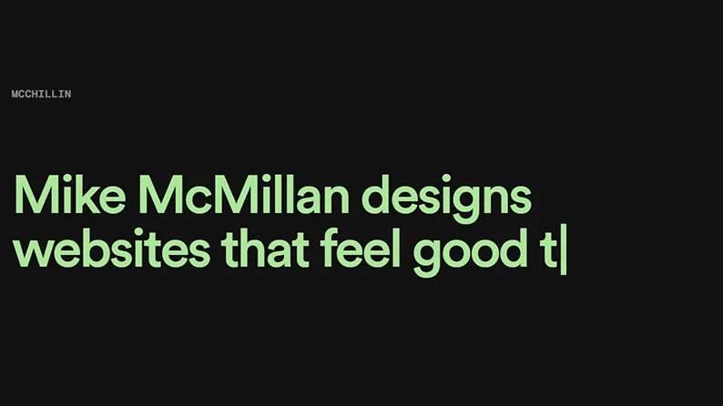
McChill’s website, designed by Mike McMillan, exemplifies minimalist design with its clean background and animated text that draws attention to the portfolio and services. The navigation is straightforward, making it easy for visitors to explore various projects and achievements.
- Clean background with animated text.
- Simple, intuitive navigation links.
- Plenty of white space for readability.
Features:
3. La La Land Kind Cafe

La La Land Kind Cafe's minimalist layout creates a welcoming atmosphere. Monochromatic colors, ample white space, and smart typography guide visitors through the content material, making website navigation smooth and visually appealing.
- Monochromatic color palette.
- High-quality images that match the overall color scheme.
- Thoughtful typography for easy reading.
Features:
4. Zimik Studio
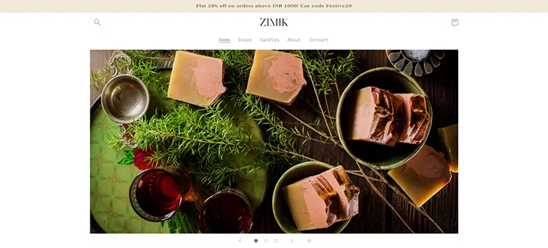
Zimik Studio’s is the best minimalist website design that uses a warm color palette and simple layout to create a welcoming atmosphere. The clickable menu button and ample white space make it easy for visitors to find what they need without distractions.
- Warm, inviting color palette.
- Clickable menu button for easy navigation.
- Monochromatic design for a clean look.
Features:
5. Zero

Zero’s website is the epitome of minimalist website design. It starts with a full-screen animation introducing services, followed by a portfolio of their projects. This arrangement ensures that website visitors are not overloaded with information.
- Full-screen animation introduction.
- Clear presentation of services and past projects.
- Centralized project display.
Features:
6. Wendy Ju
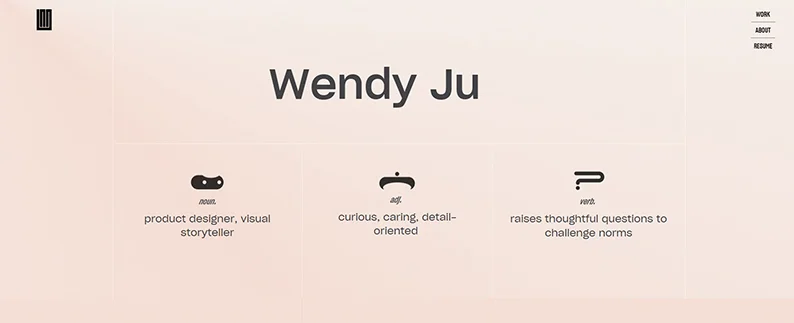
Wendy Ju’s portfolio is one of the great minimalist website design ideas. It uses simple fonts and a soft color palette to highlight her work, making it easy for potential clients to navigate and focus on her career highlights.
- Thoughtful font and color choices.
- Small, subtle side navigation bar.
- Focus on career highlights and achievements.
Features:
7. Wingmen

Wingmen’s website uses a minimalist design to present information clearly and professionally. The grid layout and white space make it easy for business professionals to process the information without distractions.
- Grid layout for easy information access.
- Professional and brief content presentation.
- Ample white space for readability.
Features:
8. Velvet Hammer

Velvet Hammer’s minimalist design caters to musicians seeking management services. The solid colors and elegant fonts follow the UX Design Principles to create a professional look, while the clean homepage design emphasizes important content and client success stories.
- Solid colors and elegant fonts.
- Text block homepage for easy reading.
- Client list with direct links.
Features:
9. Oishii

Oishii’s website showcases its products with high-quality images and plenty of white space. The various font styles and sizes guide help visitors through the content, ensuring a clear visual hierarchy.
- High-quality images of products.
- White space to enhance readability.
- Different font styles and sizes for clear visual hierarchy.
Features:
10. TrueHarvest Farms

TrueHarvest Farms combines functionality with minimalist design. Dark backgrounds and high-quality images create a visually appealing website with smooth navigation that ensures visitors quickly find the desired information.
- Dark color scheme with vivid images.
- Full-page menu links for easy access.
- High-quality images against a black background.
Features:
11. Ramotion

Ramotion uses the best minimalist website design with large fonts and a clean white background to make its message clear and easy to understand. The simple navigation and varied font weights help users navigate the site effectively.
- Large font on a white background.
- Select navigation pages for simplicity.
- Various fonts and sizes to guide users.
Features:
12. PhonicBloom
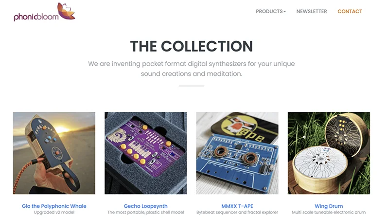
PhonicBloom’s minimal site design focuses on functionality. It displays products against a simple white background using a grid structure. High-quality pictures and clear descriptions make it easy for users to find the right product.
- Grid structure for product display.
- Simple white background for clarity.
- High-quality product images.
Features:
13. Couple
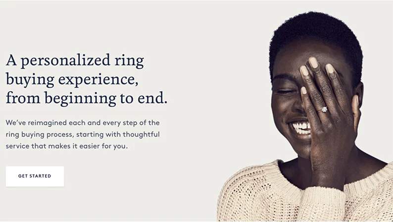
Couple is one of the best minimalist website design ideas, which is elegant and simple, using a delicate color palette and minimal distractions. The stunning images and clear visual hierarchy make navigating and appreciating the products easy for visitors.
- Delicate color palette for elegance.
- Minimal distractions to enhance focus.
- Stunning images with a clear visual hierarchy.
Features:
14. Lulu and Isabelle
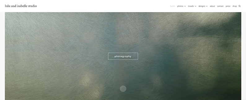
Lulu and Isabelle’s portfolio site is a great example of minimalist design, presenting professional photographs and detailed graphics with minimal text. The simple design makes it easy for visitors to view the work and navigate the site effortlessly.
- Minimal text with main categories highlighted.
- Stunning images for visual appeal.
- Simple and intuitive browsing experience.
Features:
15. ET Studio
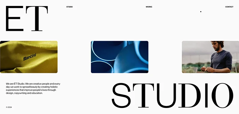
ET Studio’s minimalist portfolio site features large letters on a clean white background, making it visually appealing and easy to navigate. The high-quality images and ample white space enhance the overall user experience, making it one of the best website navigation examples.
- Large letters on a white background for impact.
- High-quality images to highlight content.
- Ample white space for a clean look.
Features:
Key Elements of Minimalist Web Design
Minimalist website design relies on several key elements to create a simple and enhanced user experience:
1. White Space
White space, or negative space, is crucial in minimalist website design. It makes the content more readable and helps users focus on important elements. Websites like McChill and Oishii use white space effectively to highlight their content.
2. High-Quality Images
High-quality images are important in minimalist design because they help convey the message easily and effectively. Sites like Velvet Hammer and PhonicBloom use vibrant pictures to enhance their minimalist designs.
3. Typography
Typography plays a major role in minimalist design. It involves selecting the correct fonts, sizes, and colors to create a visually appealing interface. Websites like Ramotion and Zimik Studio use typography to guide users through their sites effectively.
4. Visual Hierarchy
Visual hierarchy arranges elements according to their importance, making the website intuitive. Sites like Oishii and Couple use visual hierarchy to highlight key content and guide users smoothly through their sites.
5. Color Palettes
Minimalist designs often use monochromatic or muted color palettes, which enhance the site's visual coherence. Websites like TrueHarvest Farms and Wendy Ju use effective color palettes to create a clean and appealing look.
Conclusion
A minimalistic website design method that keeps things simple and useful for a clean and efficient user experience. By using elements like white space, quality images, and a clean hierarchy, you can create a website that looks good and easily accessible with InvoIdea, the reputed web designing company in Delhi. These 15 minimalist website design examples can give you ideas and show how powerful a minimalist layout is in web development. Whether you're thinking of a website redesign or starting from scratch, these standard examples will help you create a great website design.


