Navigation is a crucial part of any website. It allows users to find information and move between pages easily. With so many options for website navigation examples, how do you choose the right one?
In this blog post, we will read about 7 of the best website navigation examples from top brands. We’ll analyze what makes their navigation effective and provide tips you can implement for your website navigation.
1. Nike’s Minimalist Navigation
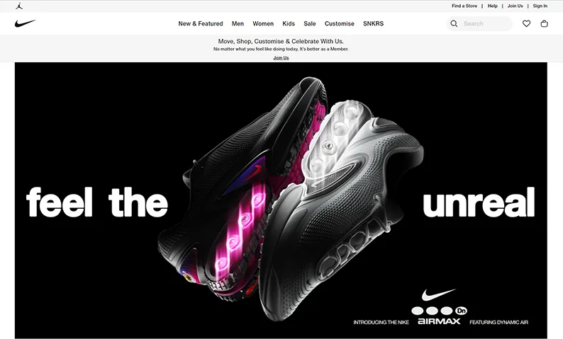
Sportswear titan Nike optimizes their navigation for simplicity by using the following:
- Stripped homepage spotlights top gear drops users crave
- Inline category and breadcrumb trails aid in drilling into shoe models and variants
- Mega drop-down supplies one-click access to the complete product range
Thoughtfully narrowing choices helps users find items quickly and make it one among the simple website navigation examples.
Why it works: Nike’s refined navigation removes obstacles to uncover coveted sportswear more easily.
2. Mercedes Benz Caters to Luxury Buyers
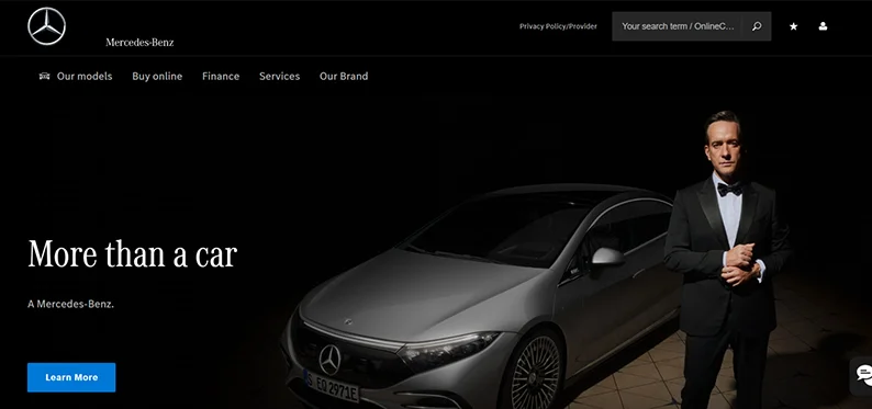
Even luxury automaker Mercedes keeps their navigation exceptionally clear by using:
- Vehicle model submenus help narrow down options
- The slick tiered hovering main menu enables progressive disclosure
- Multi-level footer supplies secondary navigation access points
The clarity matches Mercedes buyers' expectations while exposing choices incrementally.
Why it works: Crisp onboarding matches high buyer expectations while expanding navigation options.
3. Terra Outdoor's Simple Homepage

Terra Outdoor sells premium patio furniture. Their homepage keeps it concise and simple by using:
- Big spotlight images featuring top furniture collections
- A graphic visual menu shows the main furniture categories
- Bold, hard-to-miss links direct users like “Shop Now”
This simplified homepage makes finding desired products fast and frustration-free, making it one of the good website navigation examples.
Why it works: By spotlighting top categories and offers upfront, Terra Outdoor builds user confidence to click deeper or buy.
4. Rapha’s Strategic Cycling Page
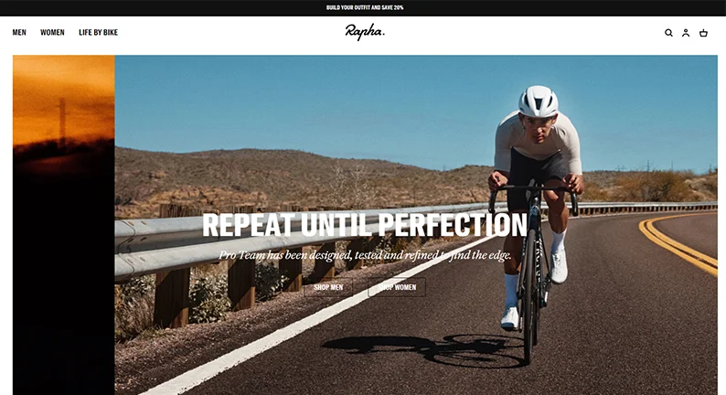
Rapha designs high-end cycling apparel. This example of website navigation groups collections by using:
- Logical clustering of cycling disciplines
- Bold imagery and links catch the eye, enticing clicks
- A clear main menu persists atop pages enabling easy navigation
This tidy hierarchy sells its products by steering users to gear purposefully, making it one of the responsive website navigation examples.
Why it works: Rapha arranges offerings smartly so target users navigate precisely to beloved cycling kits.
5. Patagonia’s Logical Online Store
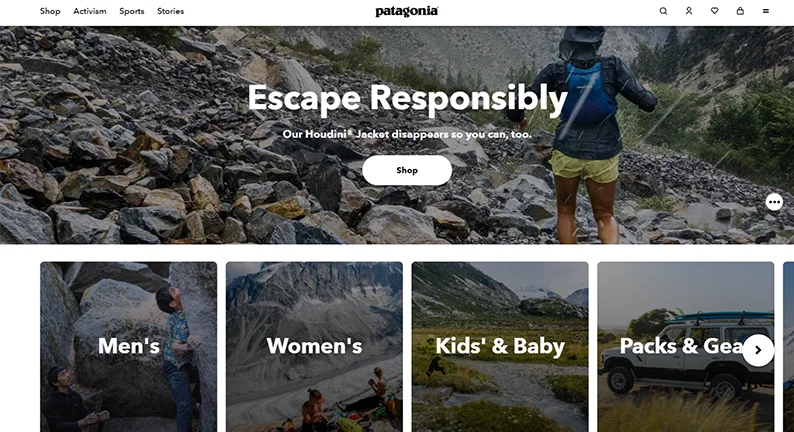
Outdoor gear leader Patagonia arranges its ecommerce site logically by using:
- A Clean sidebar menu lists gear types like apparel, gear, and activewear
- Scrolling sideways reveals gear selections and alternate colors smoothly
- Generous whitespace separates products visually
- Vibrant submenu pops to help users rapidly spot section navigations
This website architecture empowers methodical category browsing and buying by arranging sub-offerings intelligently across Patagonia’s wide gear range.
Why it works: Patagonia boosts discoverability by arranging offerings distinctly so users understand options thoroughly.
6. Cartier's Cinematic Watch Pages
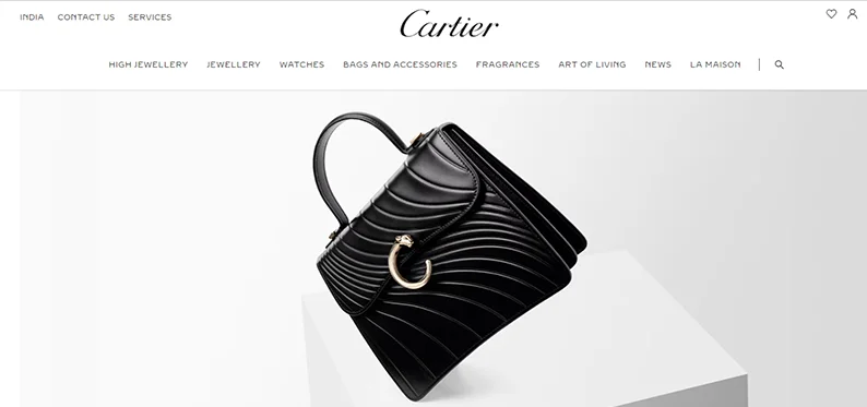
Even luxury watchmaker Cartier goes refreshingly minimalist by using:
- Bold cinematic backgrounds intrigue visitors
- Subtle menus encourage a focus on timepieces
- Scroll interactions help guide users through brand tales
Thin overlay navigation amplifies Cartier’s mesmerizing visual storytelling, which makes it a good website navigation example.
Why it works: Cartier establishes focus by allowing navigation simplicity to direct attention to ornate craftmanship shots.
7. What Is Missing Experiments Playfully

This nonprofit gets creative with navigation conventions by using:
- Full-width menu presents a clear content map
- Toggle icons filter views and data sets on the fly
- Consistent page-wide placements build reliable user landmarks
Tactical discoveries through navigation pull users into action and make it one of the simple website navigation examples.
Why it works: Clever and mobile-centric techniques guide users uniquely into civic action online.
Conclusion
Navigation is one of the most important parts of a website. The examples of website navigation in this blog show what effective navigation looks like. While the website navigation examples differ in their content, they share best practices for making navigation work.
For professional assistance in creating user-friendly website navigation, team up with a leading website design firm. Invoidea, a web designing company in Delhi NCR, specializes in crafting high-performing websites. Their design experts will assess your business goals and craft a custom web design centered around your business. The goal of navigation is to guide users smoothly to fulfill their needs, whether information or purchases.