In this virtual age, monotonous and boring websites don't really work. Visitors are attracted to attractive, dynamic, and interactive websites. Animations are an effective tool to make your website stand out and entertain customers. In this blog we will discuss some of the best website animation examples in 2024 that exemplify creativity and innovation in the website design.
List of Best Website Animation Examples
Below is a curated list of the best website animation examples in 2024. These examples show how modern animations can enhance the personal experience, make content more engaging, and create a complete uniqueness for web design. Whether you're looking for ideas on your next venture or just want to check out what's viable, these websites are sure to electrify you.
Now let's dive into each of these web design animation examples and explore the exact animations that make them stand out.
1. DeModern
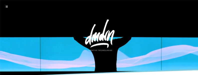
The DeModern website, as one of the web animation examples, sets the bar high for elegance, creativity, and dynamic animations. Once you get to the home page, you will be greeted by a string of fascinating videos. The use of parallax scrolling gives the images a sense of flying by as you surf the page, creating an engaging experience.
Highlights:
- The menu transitions smoothly into a hamburger menu, taking over half the page for an immersive effect.
- Vibrant transitions between pages and entertaining loading animations keep users engaged throughout their visit.
2. Twinbru
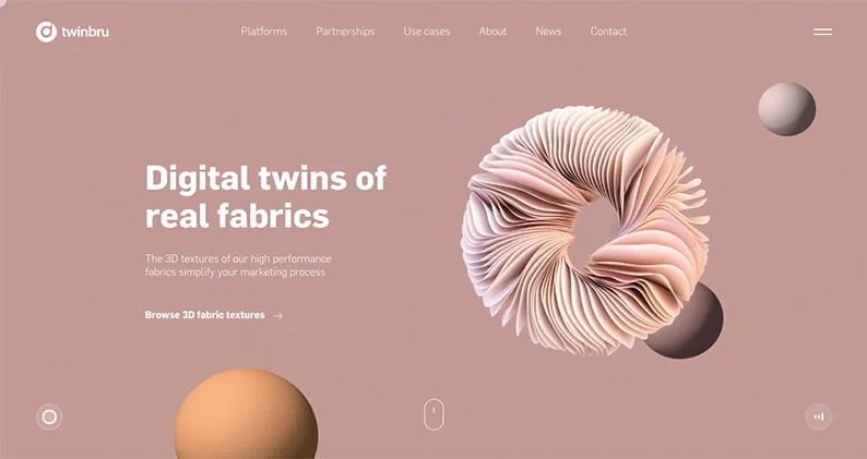
Twinbru's is one of the best website animation examples with its stunning colors and intricate graphics. The site features an SVG line drawing as a loading animation, which adds a delightful touch as the page loads. The homepage is filled with graphics and micro-interactions that respond to user actions.
Highlights:
- The hamburger menu slides over the full page, providing a seamless navigation experience.
- Responsive elements like cursor animations and 3D graphics that move with your mouse enhance user interaction.
3. K24Moscow
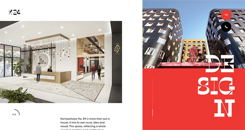
This architecture-focused web page animation example exemplifies creative animations that are both fluid and dynamic. The seamless transition of red, white, and black sections, combined with a unique typeface, creates a thrilling user experience.
Highlights:
- Fluid scroll-sensitive animations that bring each section to life by following the latest UX design principles.
- The unique typeface and color transitions make the site visually stunning and engaging.
4. Species in Pieces
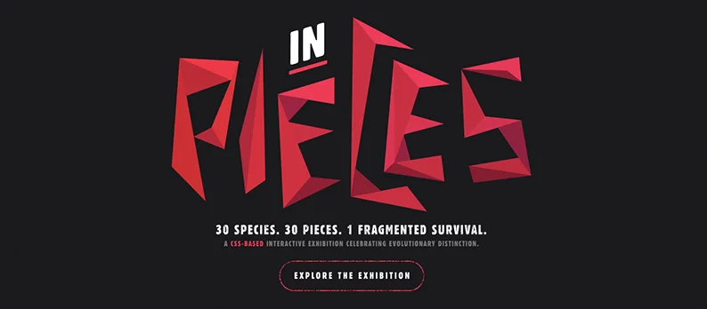
Species in Pieces stands out as a Website Animation Example with its gamified scroll-activated animations. The clever use of origami-style graphics that transform into new species with each scroll adds an artistic flair to the design.
Highlights:
- Seamless page transitions that create a smooth browsing experience.
- Playful graphics that come together and fall apart as you scroll, adding a dynamic element to the site.
5. Mamoria Basetis
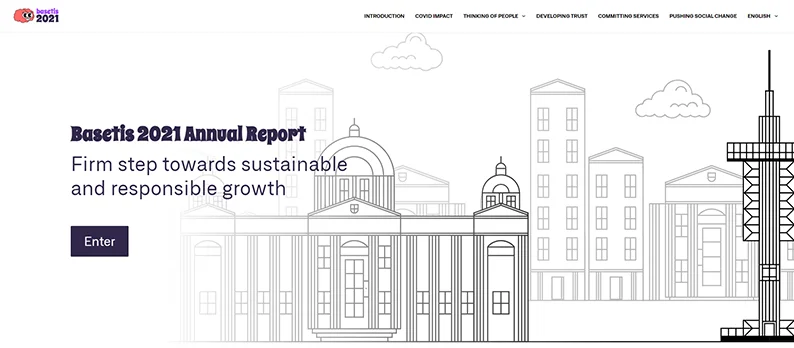
Mamoria Basetis breaks the mold with animated illustrations that guide users through a cityscape, offering an interactive introduction to the company. The responsive elements of this web page animation examples are inviting and modern, making the browsing experience enjoyable.
Highlights:
- Horizontal scrolling, instead of vertical, provides a unique navigation experience.
- Consistent graphic invitations to explore more pages, maintaining user engagement.
6. KKL Luzern
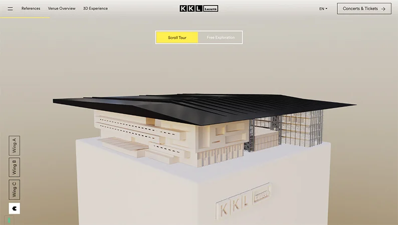
KKL Luzern as one of the web animation examples offers a virtual tour experience with meticulous attention to detail and an architectural vibe. The site uses scroll-triggered animations and interactive buttons to provide detailed information about the venue.
Highlights:
- Options for free exploration or a predetermined scroll tour catering to different user preferences.
- Animated pop-ups and interactive buttons that enhance user engagement
7. Red Panda
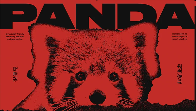
Red Panda's website follows the best web design trends and feels like a game from the start, with a fun, loading animation that sets the tone. This is one of the web design animation examples that features scroll-activated screen reveals, fade-in text, and lively pop-up images that create an engaging browsing experience.
Highlights:
- The creative use of dark red and black colors gives the site an edgy feel.
- Storytelling through animated images and text icons as you scroll.
8. The Museum of Annoying Experiences
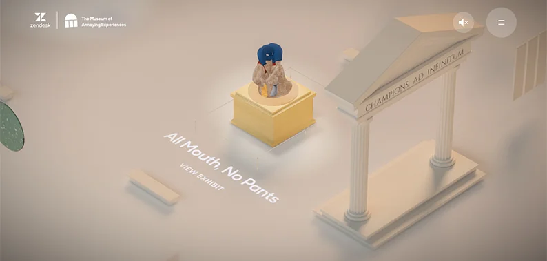
This quirky website takes users on an adventure through a world of annoying encounters, blending animations, gamification, and 3D graphics. The interactive elements of these web animation examples make the experience amusing and engaging.
Highlights:
- Creative animated icons and crisp copywriting that encourage exploration.
- Titles of exhibits light up as you hover over them, adding an interactive touch.
9. James Warner
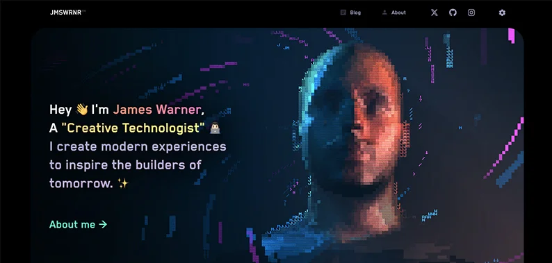
James Warner's website as website animation examples is packed with animations, from micro-interactions to macro-interactions. The homepage features a stunning pixelated image with 3D animation, creating a monochrome ripple effect when clicked.
Highlights:
- Unique icons for social media links and responsive buttons and images.
- A matrix code look is achieved through creative color blends and font choices.
10. UCLA 100
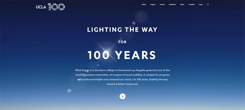
UCLA 100 offers a timeline animation on website examples that showcases key moments from the school's history. The site features a freeform timeline collage that users can discover to learn more about the institution's past.
Highlights:
- Options to view the timeline by "time" or "explore" modes.
- Various slides and handy links to topic tags for deeper exploration.
11. NTV Art
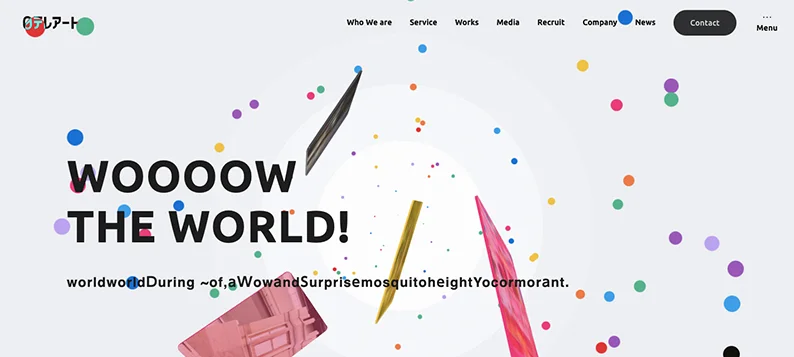
NTV Art's website pulses with creativity and art. The live background, animated cursor, and scroll-driven graphics create a vibrant feel. The site being one of the top web animation examples uses a soothing color palette mixed with eye-catching colorful bubbles.
Highlights:
- Responsive images that flip as they slide across the screen.
- A news ticker design that draws attention to text content.
12. Goliath Entertainment
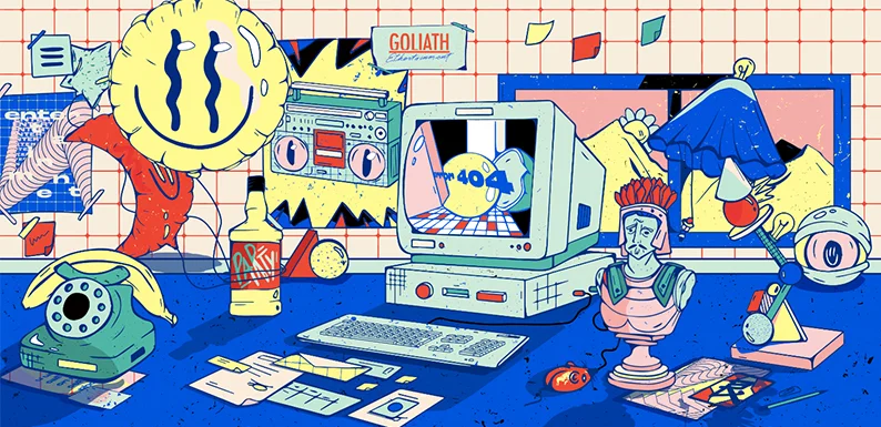
Goliath Entertainment as web page animation examples uses a pop art style with fun animations. The site starts with a suspenseful loading page and continues with interactive animations, shifting between an animated cursor and movable graphics.
Highlights:
- Hovering text boxes that leave a trail effect.
- Parallax animation and responsive images throughout the site.
13. Green Chameleon
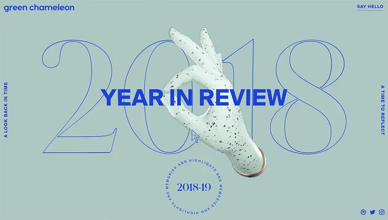
Green Chameleon takes users through the agency’s cherished moments with responsive elements like an animated cursor and 3D images. The background color of this web design animation example changes as you navigate through the virtual space.
Highlights:
- Cursor animations that transition between unique “enter and exit” icons.
- Swipe navigation instead of dragging down and across the screen.
14. Pest Stop Boys
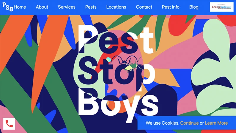
This web design animation example combines bold vector illustrations with scroll-driven animations. The text and navigation menu are scroll-sensitive, creating a dynamic and engaging experience.
Highlights:
- The cursor displays as a magnifying lens showing hidden pests.
- Creative depiction of hidden pest problems through simplified silhouettes.
15. NIKE REACT
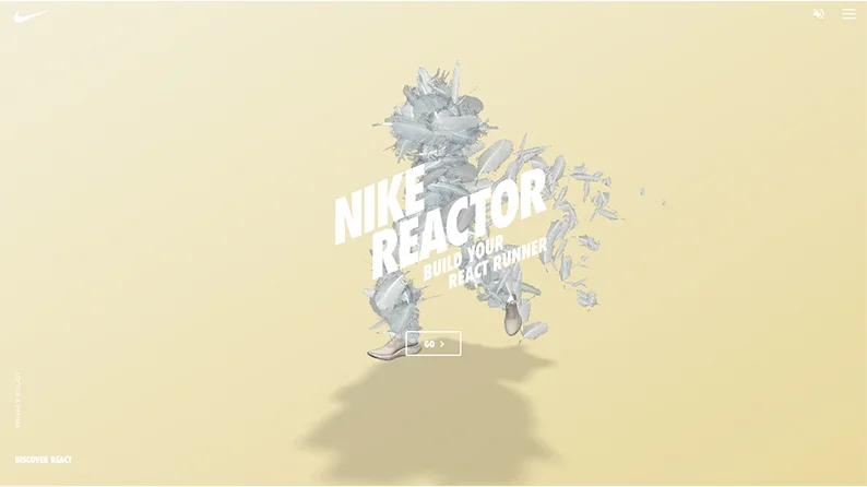
NIKE REACTOR offers an immersive experience with vibrant colors, gamification, and playful animations. The site as Website Animation Examples uses 3D graphics and responsive buttons to create a front-row seat to the running world.
Highlights:
- High-quality 3D video and vibrant colors.
- Moving shadows and creatively designed animations.
16. C2 Montreal
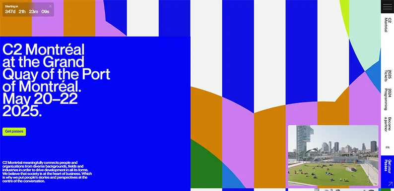
C2 Montreal’s website is a digital playground with two color palettes and dynamic elements. The interactive graphics and animations of these top landing page design ideas make the browsing experience engaging and fun.
Highlights:
- Dynamic backdrop and responsive graphics.
- Interactive elements that transform as you hover over them.
17. Some Folk
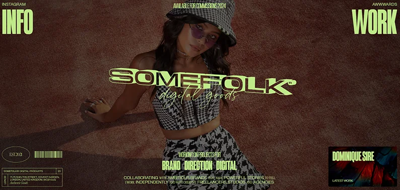
Some Folk features a 3D text hover-tilt effect on the homepage and a fullscreen section layout. The contrasting color palette of this animation on website examples gives the site a monochrome effect.
Highlights:
- Vertical stacking of screen sections creates a unique and best website navigation menu.
- Creative use of contrasting colors and 3D effects.
Conclusion
These best website animation examples in 2024 demonstrate the power of animations in enhancing user experience and engagement. From scroll-activated animations to 3D graphics, these examples show how creative and interactive design can make a website stand out.
Incorporate this animation on website examples into your website design process to create a visually stunning and engaging website for visitor retention.


